A Curious Curve
Last week I created a function to evaluate the range of values around the average for a set of data at percentiles one through a hundred.
def fracrange(values):
    """
    Useful for calculating the answer to the question:
    What's the range around the average if I look
    at only XX% of the data?

    Results is a list of tuples:
    0. Percent of data considered.
    1. Average value.
    2. Average of min/max in range of data considered.
    3. Min in range of data considered.
    4. Max in range of data considered.
    5. Distance from min to average.
    6. Distance from max to average.

    Description of algorithm:
    1. Calculate average.
    2. Calculate distance from average.
    3. Sort by distance from average.
    4. Start with:
       100% of the time and range, max/min of values
    5. Throw out 1% most distant data points.
        99% of the time and range, max/min of values
    6. Repeat 5 until 1% of the time.
    """

    total = float(sum(values))
    average = total / len(values)

    distances = [(abs(average - value), value) for value in values]
    distances.sort(key=lambda tup: tup[0])

    fraction = 0.01 * len(values)

    results = []

    for percent in reversed(xrange(1, 101)):
        while len(distances) > (fraction * percent):
            distances.pop()
        if len(distances) == 0:
            continue
        max_val = max(tup[1] for tup in distances)
        min_val = min(tup[1] for tup in distances)
        max_dist = abs(average - max_val)
        min_dist = abs(average - min_val)
        results.append((percent, average, (max_val + min_val) / 2.0,
                        min_val, max_val, min_dist, max_dist))

    return results
Once I had that function working, I spun up IPython and tested it on some simple data. Below, values, are simply val * rand() where val iterates from 1 to 1,000 and rand() produces a number between 0 and 1.
values = [val * random.random() for val in xrange(1, 1001)]
xvals = list(xrange(1, 1001))
plot(xvals, values)
results = fracrange(values)
errorbar([tup[0] for tup in results], [tup[1] for tup in results], yerr=[[tup[5] for tup in results], [tup[6] for tup in results]])
Here's the plot for values:
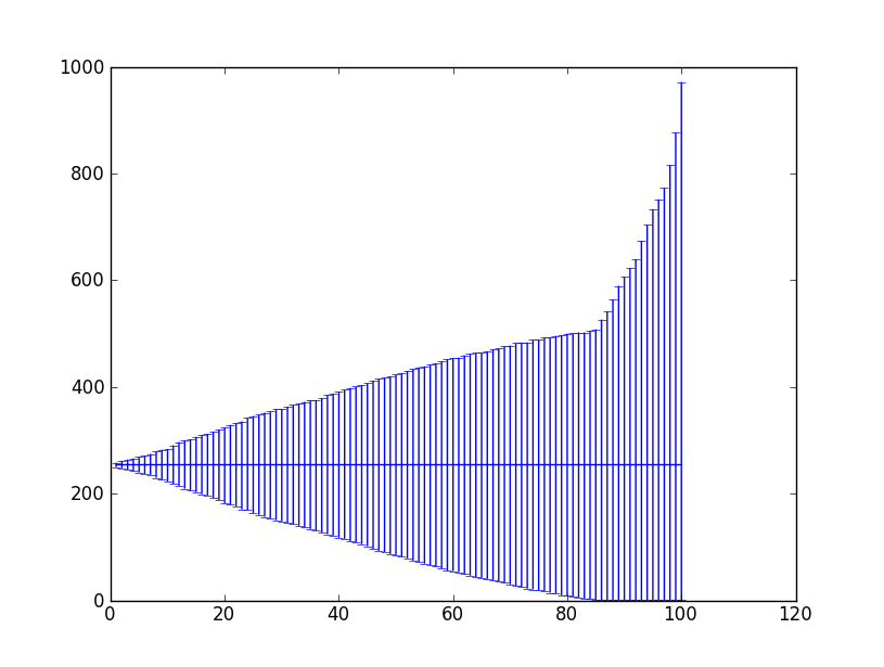
And here's the plot for showing the ranges produced by fracrange:
I thought this graph was quite curious when I first saw it. The average is the straight line you see around 250. The x-axis is the percentile of data considered. So you'd read the midpoint of the x-axis as 50% of values were between ~75 and ~415. Values are excluded from greatest-from-the-average to least in descending order.
Curiously, there's an inflection point in the curve at about the ~85th percentile. Given the uniform distribution of random values, I think the average makes sense as approximately 1/4th the range. And the inflection point seems to occur where the values excluded are more than double the average. It makes sense that a greater number of values will be near zero rather than more than twice the average but why ~15%? That number eludes me.
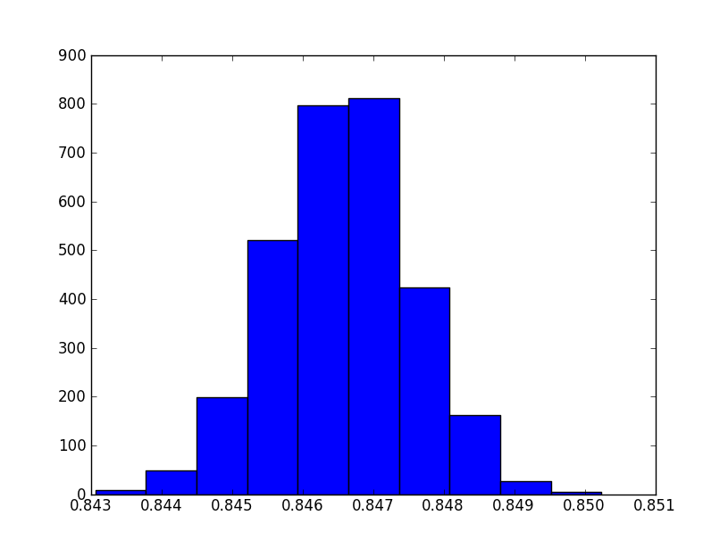
I did some further analysis to see if, on average, the inflection point was at the 85th percentile. Here's a histogram of the results with 100,000 values repeated 2,000 times:
Looks like a normal curve to me. But it's not centered on 85. My closest guess is somewhere around the 84.65 percentile.
So given the way values was computed above, this data says a little less than 15% of values will be more than double one-half the range.


